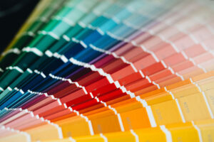
Selecting the right colors for signage is crucial for ensuring it remains visible and legible at all hours. Colors can dramatically change appearance from daylight to nighttime, and choosing the right hues is key to making sure a sign effectively communicates its message no matter the time of day. The Pantone Matching System (PMS) is a vital tool in this process, providing a standardized palette that helps sign makers maintain consistency and clarity in their designs.
Why Color Selection Matters
Colors behave differently in various lighting conditions. A shade that appears vivid and clear in the daytime can become muted or difficult to see at night. This is where careful color selection comes into play. Sign makers must consider how colors interact with natural light, artificial illumination, and reflective materials to ensure 24-hour visibility. Here’s how Pantone colors come into play for maximum effectiveness:
Key Considerations for 24-Hour Visibility
- Color Perception Changes: Colors can appear different when viewed in natural daylight versus artificial lighting at night. For example, Pantone 485 C (a vibrant red) looks bold in sunlight but can lose its intensity at night. To counteract this, sign makers select Pantone shades that maintain their visibility in both conditions.
- style=”padding-bottom: 5px;”High Contrast for Readability: High-contrast color combinations ensure that text and graphics stand out on a sign, whether it’s day or night. Combinations like Pantone Black C on Pantone Yellow C offer excellent contrast, ensuring the message remains readable at all times.
- Reflective Pantone Colors: For nighttime visibility, especially on road signs and safety markers, reflective materials combined with Pantone colors like Pantone 109 C (bright yellow) or Pantone 7406 C (deep yellow) help signs stand out when illuminated by headlights or other light sources.
- Illuminated Signage: Signs that incorporate internal lighting, such as LED or neon signs, require Pantone colors that won’t become washed out. Bright hues like Pantone 2935 C (vivid blue) and Pantone 186 C (strong red) retain their vibrancy when backlit, making them ideal for illuminated signage.
- Reducing Glare: Some colors can create glare under bright lights, making signs hard to read. Using matte finishes and choosing Pantone shades like Pantone Cool Gray 11 C can reduce glare while maintaining legibility.
- Environmental Lighting: The surrounding environment plays a significant role in color choice. In urban areas with plenty of ambient light, darker Pantone colors like Pantone 2768 C (deep navy) paired with a light contrast color work well. In darker rural settings, brighter colors like Pantone 368 C (vivid green) are more effective for visibility.
- Fade Resistance: Outdoor signs are exposed to UV rays, which can cause colors to fade over time. Pantone offers fade-resistant pigments, such as Pantone 485 C, which helps maintain color vibrancy despite prolonged sun exposure. UV-resistant coatings are also used to protect colors and ensure durability.
- Reflective Options for Nighttime: Reflective signage benefits from Pantone colors that are highly visible in low-light conditions. Colors like Pantone 165 C (orange) and Pantone 354 C (bright green) work well with reflective materials, ensuring signs are seen when illuminated at night.
- Brand Consistency: For businesses, it’s essential to maintain brand colors even in signage. However, some adjustments may be necessary for nighttime visibility. For instance, a brand color like Pantone 300 C (bright blue) might be lightened to Pantone 299 C for enhanced visibility at night, ensuring consistency while maximizing legibility.
- Safety and Regulatory Compliance: Safety and directional signs often require specific Pantone colors for compliance and visibility. For example, Pantone 485 C (red) is used for stop signs, and Pantone 348 C (green) is used for directional signs. These colors are chosen for their high visibility day and night, ensuring compliance with safety standards.

Conclusion
Choosing the right colors for 24-hour sign visibility involves more than just aesthetics. It’s about understanding how colors interact with light, materials, and the environment to ensure signs are effective and legible at all times. Using the Pantone Matching System allows sign makers to select and match colors accurately, ensuring consistency, durability, and compliance with safety regulations. By carefully selecting colors that perform well in both daylight and nighttime conditions, sign makers can create signs that not only catch the eye but also effectively communicate their message around